
Truth or fiction? Oh yes, this time it’s definitely true – we’ve rebranded the image of the Skeptics Society. And from now on, a bright green light for the truth and no more fabrications.
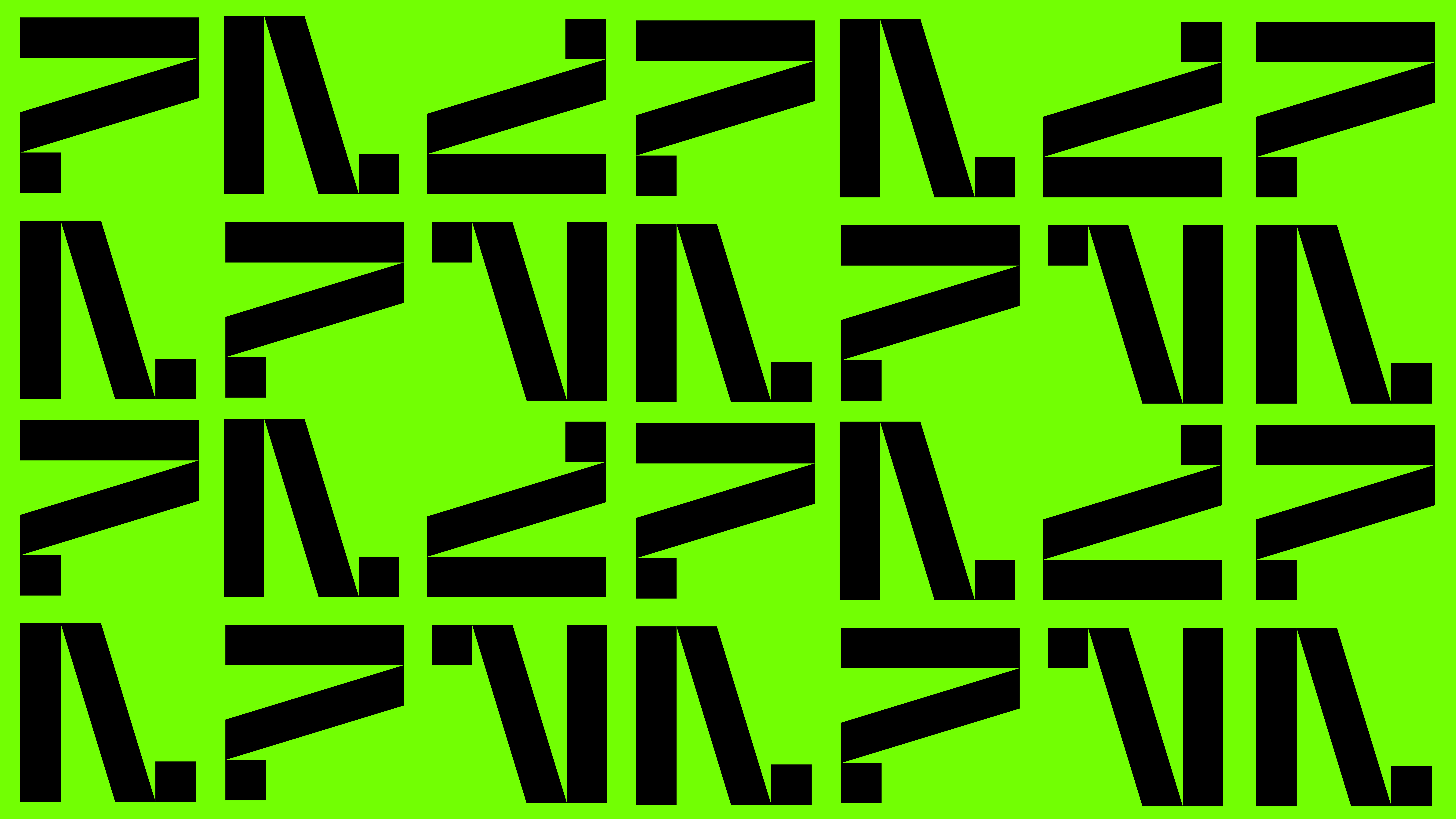
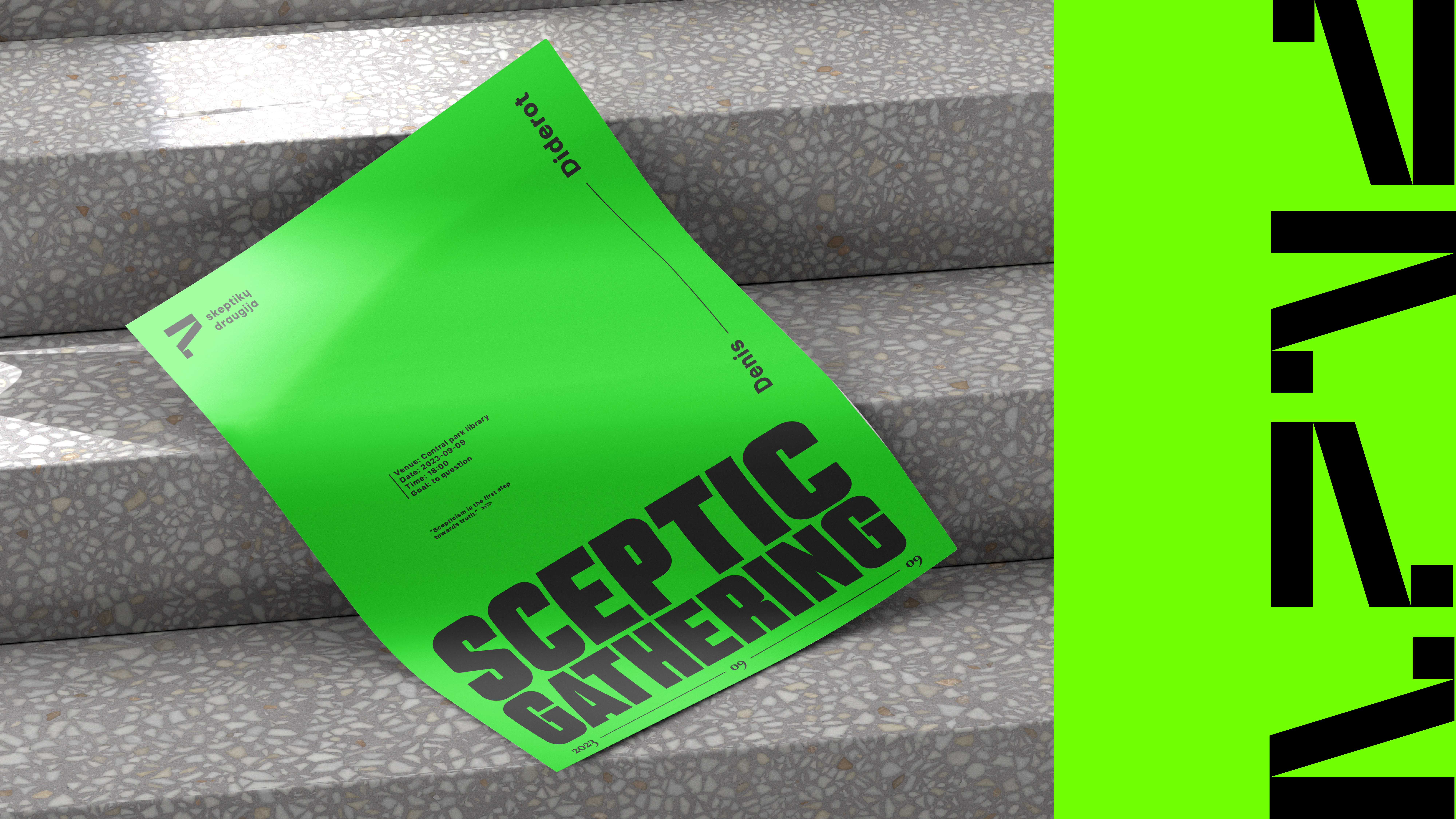
The contrasting typography is meant to empower the public to see from another angle, because sometimes you just need to get out of your bubble a little bit to realise – and it could be different. A different design, simple in its extraordinary way – bright with small accents, and that the Skeptics’ reality is based on facts in the design screams out in headlines that even the biggest dreamer will notice.
In designing, we tried to “sell” the interesting sceptic debate as an alternative, more interesting, more “millennials” product and we ended up with a not-so-comfortable image that never ceases to raise the question “why”?