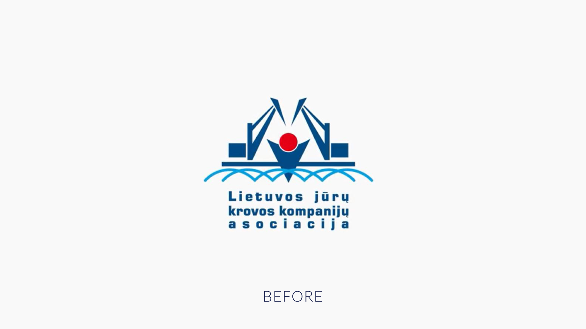

Logo and visual identity of Association of Lithuanian stevedoring companies
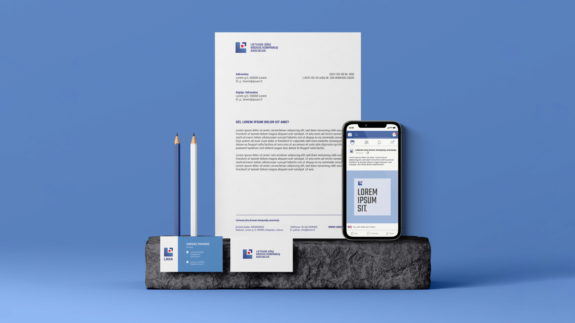
Our client trusted an assignment to redesign and adjust the new logo for modern media while maintaining its recognizability.
Many years of experience and the importance of the association members for the Klaipeda city forced our creative team to look at this project carefully and gravely because it was one of the most complicated tasks to accomplish.
At the beginning of the project, our team visited these companies of the Klaipeda port. The creative team searched for an inspiration to develop a modern and fresh visual identity witch would maintain its meaning.
Keeping the logo recognized stylized some of the geometric shapes of the old logo (arrow, square, and a circle). They reflect the environment of the port members meaning ships, shipments, and work that doesn’t get interrupted. Those geometric details create value and enhance the companies work principles.
The enhanced colors of the original logo strengthen the impression of a modern identity and add dynamic.
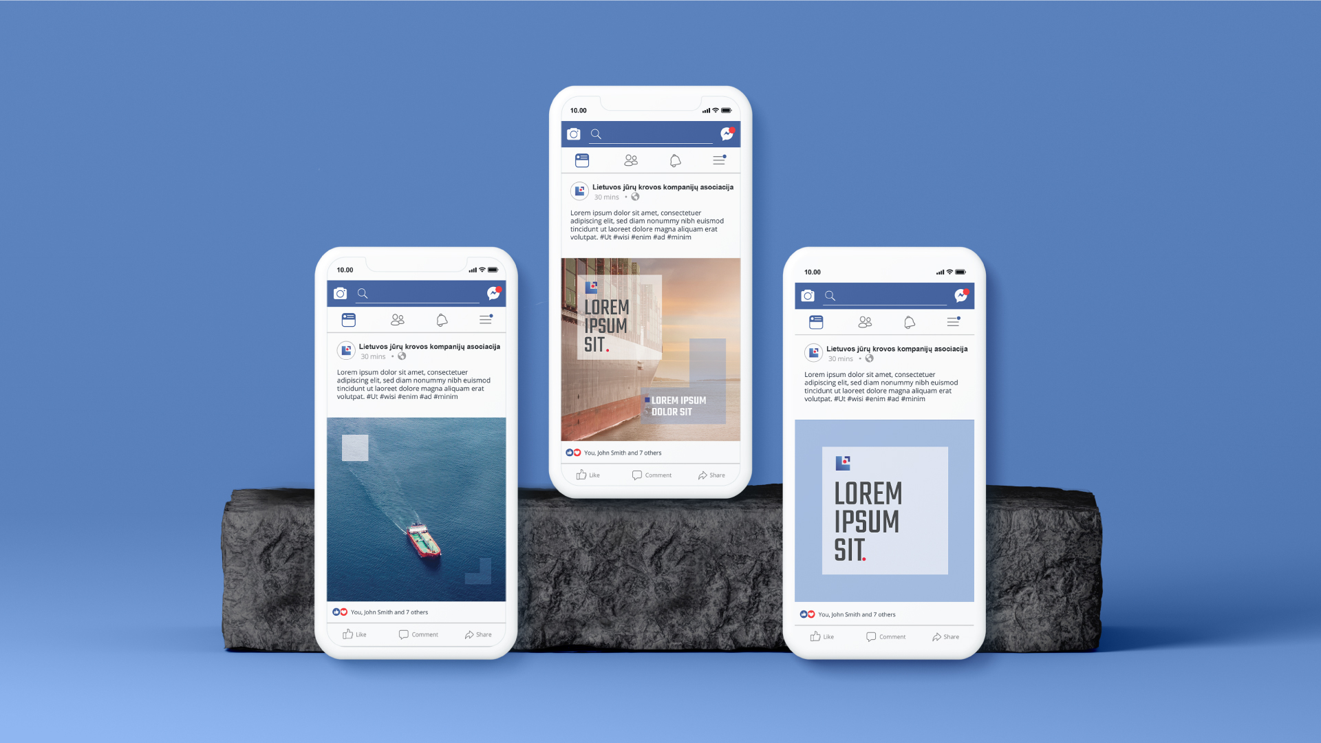
Every aspect of the process helped to create a solid visual identity for the association. Also, the brand identity is adaptable in every media of communication.
#graphic design #visualidentity #logo